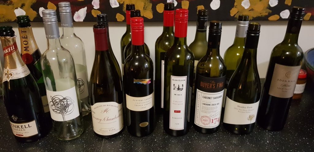
We have all been there. You race into a bottle shop on the way to somewhere and need to choose a bottle of wine quickly. Your mind reels as you try to take in all of the options, scanning labels for anything familiar trying to divine some clue about what might be good only to give in and get a wine with the most medals or an colourful Australian animal. Be honest…we have all done it.
Wine labels have evolved over the years from providing basic details about the wine e.g. name of producer and location, to including information required by law e.g. alcohol levels and warnings, to marketing tools to differentiate from the next bottle on the self e.g. medals. But it is when it comes to label art that wine labels take it to the next level. For example the label below is pretty typical of old school wine labels before the marketing team got to them.

Some would say this label is boring but it does tell you:
- The producer i.e. Penfolds;
- The name of the wine i.e. Bin 389;
- The grape varieties i.e. Cabernet Sauvignon and Shiraz;
- A bit about the wine;
- Where the grapes came from i.e. South Australia.
But imagine you are presented with a row of bottles with functional but similar labels from all over the world. Which one do you choose?
So along comes a company called Casella Wines who have alot, and I mean ALOT, of wine to sell. Wine that is cheap and cheerful and needs a a big market like the United States market. But how to grab the attention of consumers amoungst a wall of similar labels. Obvious really…put a stylised Australian Animal on it and viola…Yellow Tail.

Now the label still tells you much of the same information but it certainly stands out. If you saw both labels on the shelf which one would you be most likely to gravitate too?
And this is no coincidence Casella Wines did their market research and found that Americans love Australia but in particular Australian animals. And what better way to represent them than colourful stylised Australian Animals. Let’s just say it was a huge hit for them and put Australian wine on the map. You find more details about the story here.
And this set off a trend where wine labels became more about marketing than information…trying to capture attention in a very crowded market. From Portraits of the actual founder i.e. Peter Lehmann

To stylised magpies. Nothing is out of limits now when ti comes to wine labels.

So the next time you are in a bottle shop here are some tricks for navigating wine labels:
- Avoid wines with a colourful Australian Animal. These are generally high volume lower quality wines targeted at a mass market;
- Looks for wine regions typical for that grape e.g. Yarra Valley for Chardonnay, Barossa for Shiraz;
- Look for labels with a bit of information about the wine. For example if you are looking for a light bodied wine the label might be able to give you some clues;
- Try to find wines that are a couple of years old. This is especially important for red wine as two years old reds can be a lot softer than very young wines.
Cheers,
When if doubt feel free to contact me on my Facebook page for a lifeline and free wine advice.
Tony.